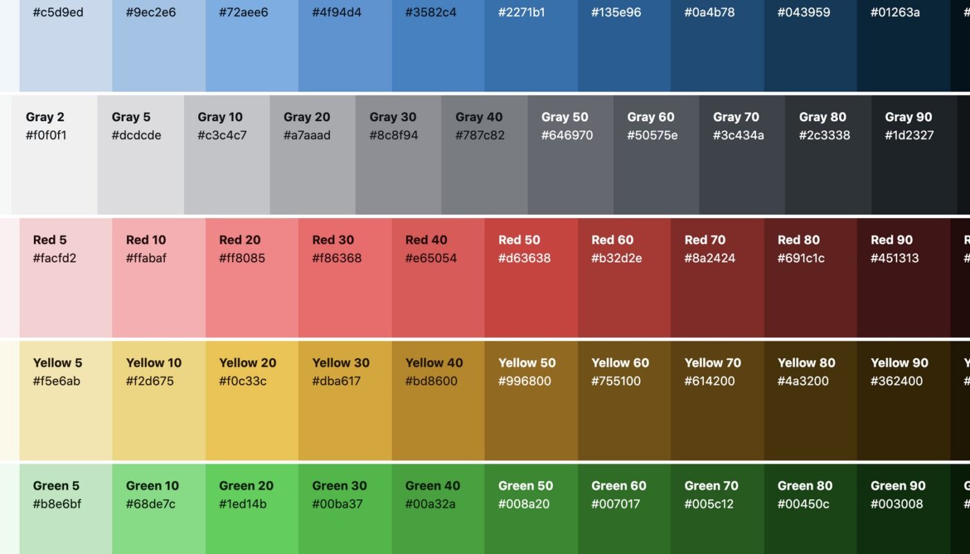
There is nothing more important than choosing the right color for bringing any web page to life. Nor can you find anything more damaging to your content than the wrong choice of colors.
There is an opinion that the impression of a site is formed in a person in the first 10 seconds of a visit. It is believed that these are minutes, or even hours. Either way – making sure your site’s content and color scheme is consistent with each other is essential to any successful site design. It will hardly surprise anyone if a web designer strives to ensure that the chosen color scheme becomes an element that enhances the expressiveness of the site as a whole, but does not distract or distract the attention of any users.
For any website design, color is the most important element.
The color scheme of the page sets the background mood, at the same time making it possible to highlight the necessary parts of the page content as more or less priority areas for the focus of the user’s attention. The essence of this approach lies in the hypothetical idea of color as a trigger that plays for most people, which is responsible for connecting attention to an object or, on the contrary, its dispersion relative to the object. Naturally, all this happens, they say, at an unconscious level, and therefore the color harmony in the end should be selected by the designer on a whim, intuitively, but the goal justifies both the time and the money if the intrigued visitor is happy to be involved in the goals of your project – whether it is information that interests him, entertainment or questions of buying and selling goods, etc.
Fortunately, to help web designers, there is always an arsenal of the most obvious ways to check the reliability of the correct choice of colors, as well as its impact on the harmony of the overall content. For example:
- The color expresses the mood and even the individuality of the site
- It also expresses the purpose of the site, its purpose.


